How to combine facts and emotions to make your sales pages irresistible
Cold, hard facts vs the warm fuzzies of belonging on the KNOW offerings page
One of the more interesting challenges of sales pages is writing for emotional impact, *in addition* to providing the information that potential buyers will need to know in order to make their decision.
This goes beyond replacing “fee” with “your investment”, or adding verbiage along the lines of “this course will change your life”.
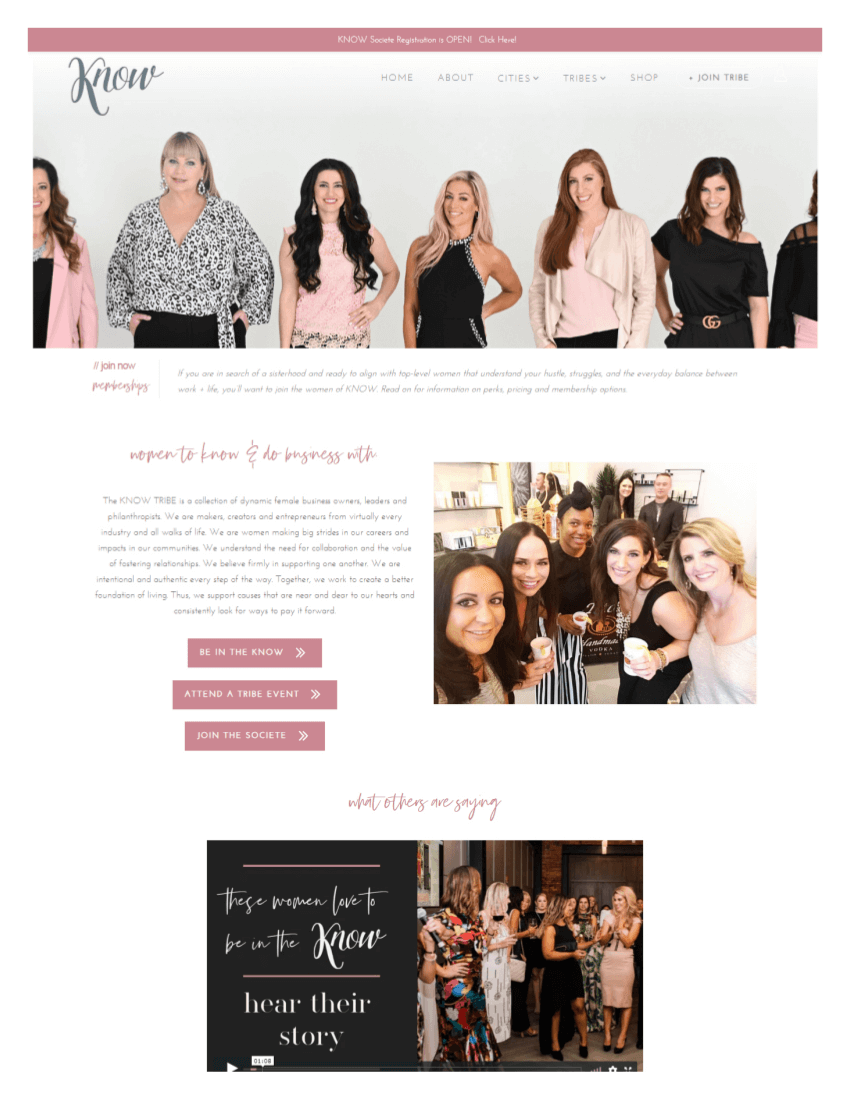
One of the most interesting examples of a sales page where emotions overwhelm, and facts underdeliver, is this KNOW page. I’ve had that page saved for some time, and the website has been updated. An interesting decision that might have to do with the sales cycle & the need to warm up potential participants.
Still, I think it’s worthwhile to take a look at the old page to see how emotional drivers change throughout the page, and to see how adding offer details might have made the page stronger.
Don’t get me wrong. Warm fuzzies are important.
We want warm fuzzies!
But we also want to explain the benefits and show the transformation. We want to support the warm-fuzzies-induced decision to join with “rational” reasons to do so.
This is why you need to optimize your copy for emotional impact
Messy humans have feelings (not exactly a surprising discovery)
Even if you are not listening to every new episode of the Freakonomics podcast as soon as it’s out, you probably know that many, many factors influence your decision to buy (or not buy) a product.
Case in point: shopping while hungry means more greasy, oily, sugary foods in the cart, or even binder clips, apparently.
So it’s not surprising that our emotions, too, can influence the way we make decisions – and even think about future.
Not surprisingly, tugging at the heartstrings – or eliciting tears of joy – has been part of advertising for quite some time. Whether to increase memorability of messaging, to write persuasive copy, or to optimize a sales page for conversions, appeals to emotions are part of a marketer’s (or a copywriter’s) toolbox.
KNOW emotions: belonging to the “KnowTribe”
Consistent messaging & clarity across page elements to facilitate self-selection
Though I tend to cringe cringes at the term “Boss Babe”, I think that the website does an excellent job of using design, copy verbiage, and videos to position their offerings for a very specific audience.
Here are some copy examples that help create a sense of belonging to a very specific group of female business owners and entrepreneurs (and push away the people who wouldn't be a good fit):
“tribe”
“Pillar of Wisdom”
“authentic”
“mantra”
...and more.
Interestingly, there are two different ways in which the need to self-select can play out:
self-verification (people from my group are members), and
self-enhancement (people I aspire to be like are members) .
While the copy says that people in all stages of business development are welcome, it appears to speak more to the self-verification crowd. This makes sense, given that out of the offerings on the website the book is most likely the most expensive one (although we don’t really know).
However, this particular page is trying to do several jobs at once: serving as a hub for 3 different offerings, while encouraging people to apply for a membership.
My guess is that many people never made it past the video and clicked through to look at other pages (or signed up for a mixer).
However, in this post I want to focus on the “heart vs. head” aspect of the copy, and the reasons why emotional response is not enough to move readers to apply. This is true even if there are no additional distractions pulling them away from the main offer.
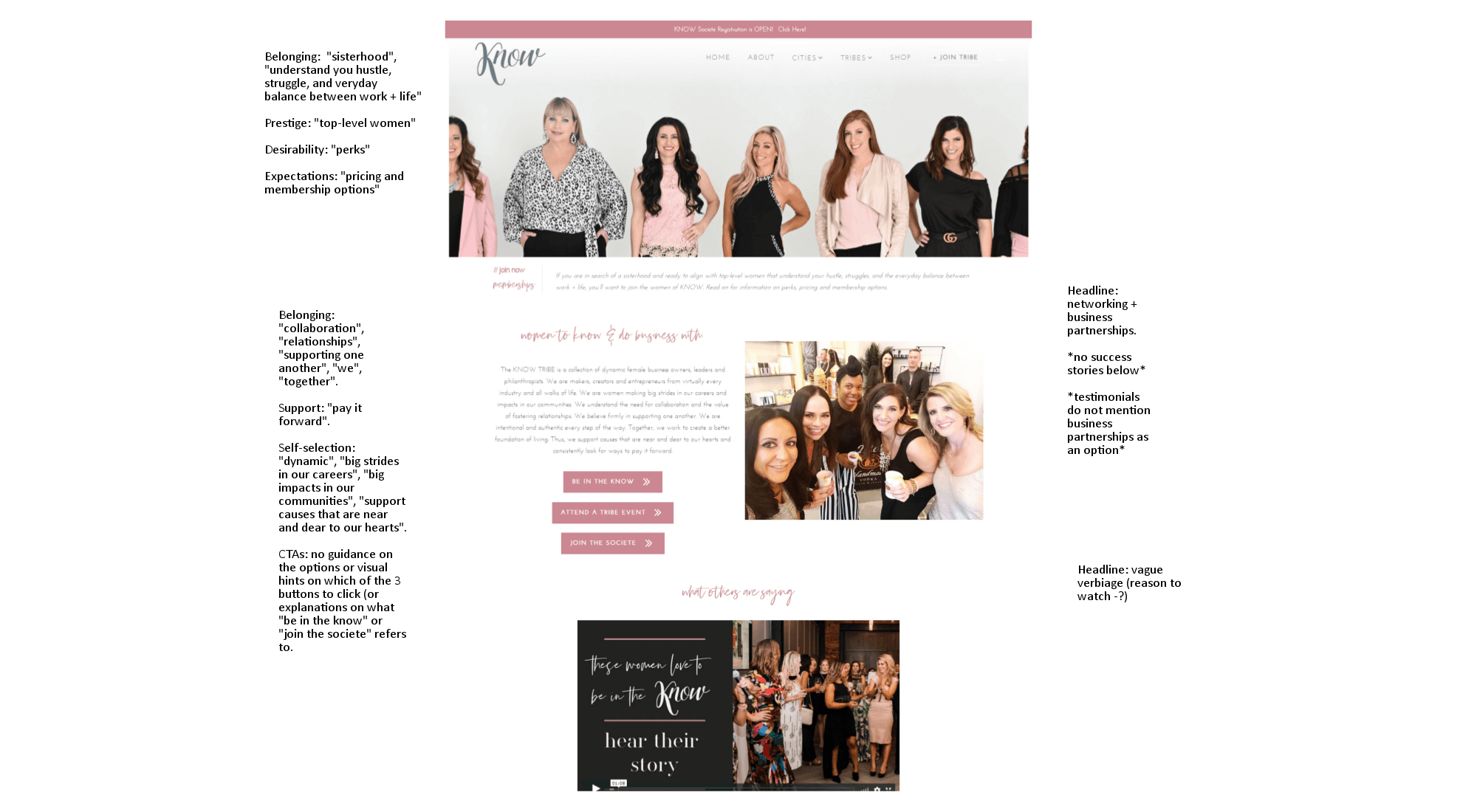
This is a group of people like me - but what’s the outcome?
Now that the sense of belonging has been established, what is the appeal of getting into the KNOW book?
KNOW has both a tagline and a mantra: “collection. collaboration. community” and “lift and rise” respectively.
Both of them are doing their jobs, but they are too vague to the job of a big idea.
However, the biggest issue is not having any outcome- or value-related information on the page (“Connect” and “Be in the know” are sort of trying to do that, but are too vague to make any specific sense, even if you crave the feeling of connection).
Showing the benefits of reaching out to become “part of the tribe”
Why even Boss Babes fully aligned with the KNOW mission can start dropping off at this point
Especially for complex products, it not only makes sense to appeal to emotions, it brings results.
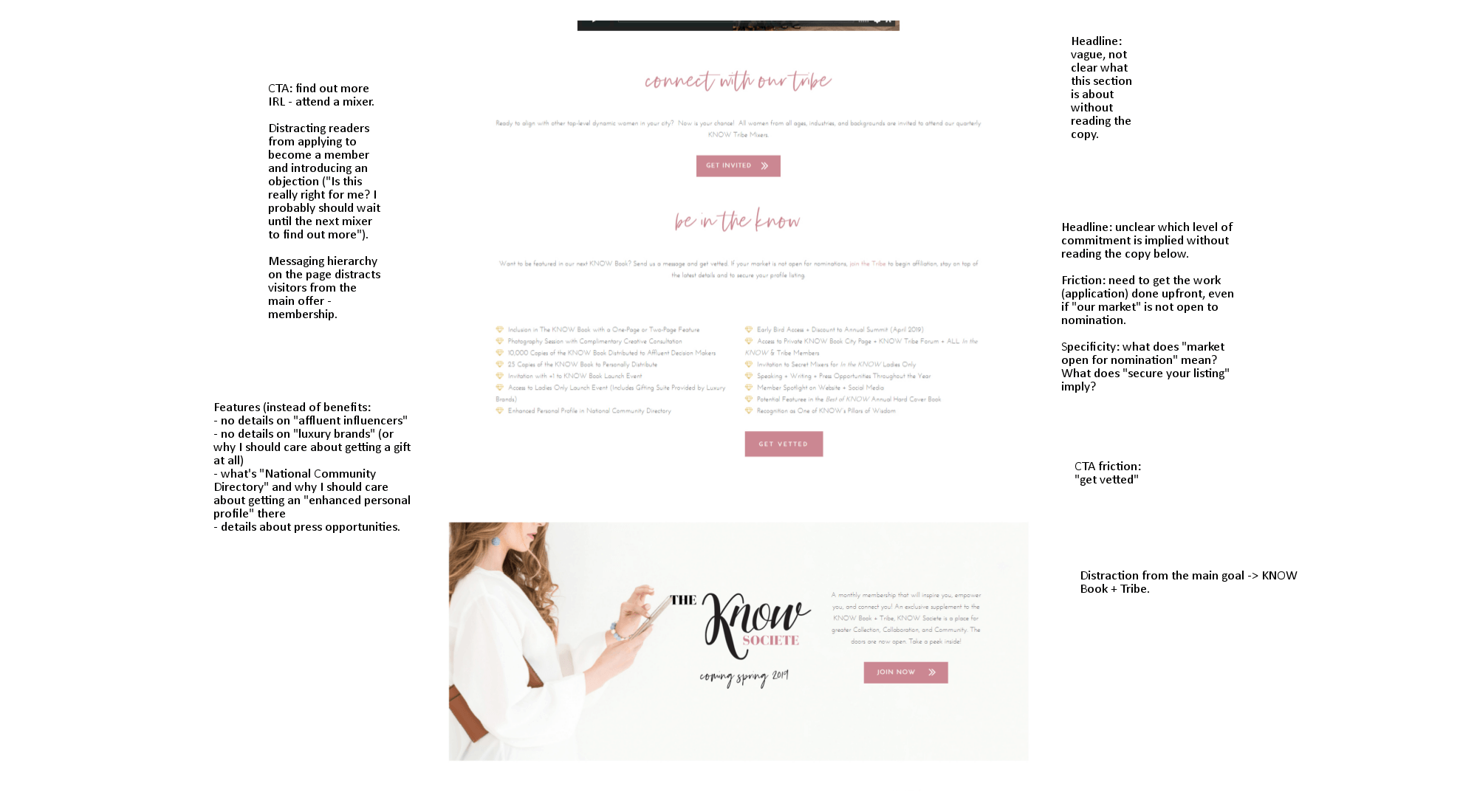
However, even for people who are ready to buy, there is no information on what the application process looks like. The closest the website comes to explaining just how the KNOW membership works is the diamond-points list towards the bottom of the page:

The list shows what’s included in the membership, but doesn’t speak to the benefits (as in, “what’s in it for me?”).
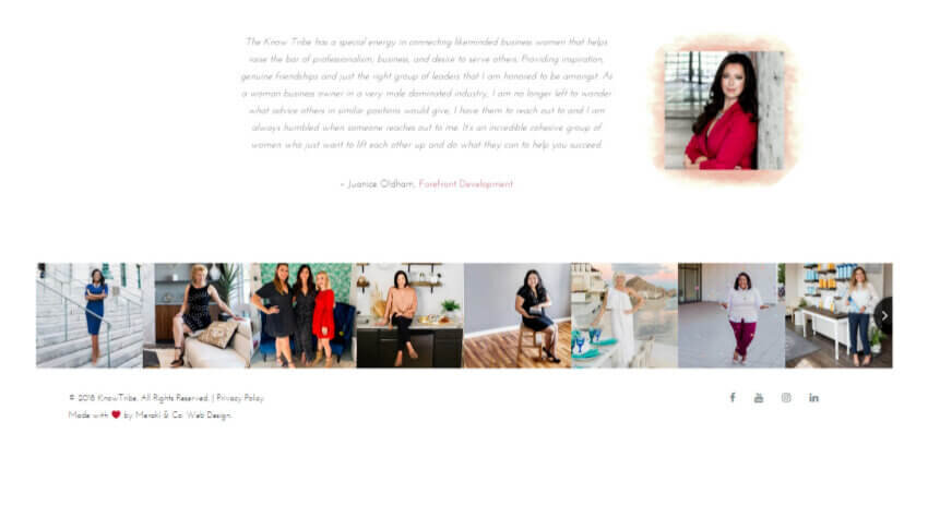
Same goes for the testimonials. The KNOW membership sales page does include a testimonial – but it is buried at the bottom of the page and does not contain any specifics on how being part of the KNOW community improved their business, their mindset, or their bottom line (same goes for the YouTube video on the page).
Testimonials have been shown to increase trust and readiness to buy. This is a missed opportunity to help interested website visitors justify the purchase.
Similarly, linking to an application form without providing the specifics of the application process creates an unnecessary friction point.
Killing the mood: anxiety-inducing CTA word choices
They may be causing drop-offs among even the most excited #bossbabes
Another missed opportunity to get more applications is the emotional inconsistency on the page. Here’s what I mean by that.
The copy does its damnedest to make you feel like you want to be part of the group.
You learn about different ways to be part of this wonderful movement…
You watch the video telling you more about it…
You see all the wonderful things that could be yours if you were to become a full member (and a Pillar of Wisdom).
And then you get to the CTA: “GET VETTED”.
Not very appealing.
It can make applicants feel like they are about to be judged – and possibly rejected.
Even “Apply for membership” would probably be better (though this still leaves plenty of room for improvement).
I don’t think that this is a deliberate decision to drive away all applicants except the most determined ones.
Tracking what’s happening on the page – and even asking the KNOW audience questions on the page – might have helped figure out whether or not this is what’s happening (or, since the page has been updated, has been happening).
In this case, making a live chat available for peak times (presumably during the application drive once a year) may be an effective way to determine what’s stopping them from applying to be part of the KNOW.
If there are no peak application times, it may be worthwhile to track how website visitors are interacting with the page. Are they desperately clicking around, as I was, trying to find information about pricing and ROI?
Lessons learned: what you can do to improve verbiage around your offers
What the KNOW website teaches us about reconciling emotions and facts
Make sure you think out your messaging hierarchy and avoid distracting your readers
Just as with lead magnet funnel creation, presenting multiple offers in a confusing way can cost you buyers. Instead of mixing “offer overview” and sales pages, create a separate sales page for each of the offers.Combine emotional drivers with factual information to boost the credibility of your offer, and to counter common objections
While purchasing a ticket to a mixer is a low-cost and low-friction sale, committing to a more expensive purchase is not likely to be done for purely emotional reasons (unless the pain of not having access to your product is already excruciating for your website visitors)Use testimonials to address the emotional triggers and to build credibility
It’s great to make new friends - of course! But it’s also good to know that they’ll help you get more business and grow your companyDon’t make your readers guess - explain the terms, explain the application process, and list the price
Knowing what comes next helps overcome friction and helps set expectations (as well as filtering out people who might be a better fit for a digital-only membership)Emotions matter and you absolutely should appeal to the emotions of your target audience through copy and design. Just make sure you’re not bringing on a panic attack when you’re asking for a sale.

I help B2B SaaS startup founders and marketers get more traction with research-driven conversion copy — without slowing down their growth initiatives.
Hire me for:
Customer research to ramp up your growth
Website audit to find & fix conversion blockers
Day rates to optimize your landing pages, web copy, or email sequences for more clicks and signups